Products
Solutions
Resources
The need to bring curiosity to data; a Facebook anecdote

In spring 2020, an unplanned event reshaped internet traffic as we know it: a global wave of pandemic-induced lockdowns! This is a story of how it led to some unexpected learnings, from a Facebook insider’s perspective.
While the global pandemic eased up traffic on our roadways, it also meant that more people stayed home. And they spent more time consuming content and media over the internet. A lot more. (see research paper or news for detail)
Around the world, people watched a ton of video. And this increased bandwidth consumption on most networks and put unprecedented strain on network infrastructure. Governments and Telcos around the world panicked — because the last thing anyone wanted at that moment was a grinding deadlock of the internet.
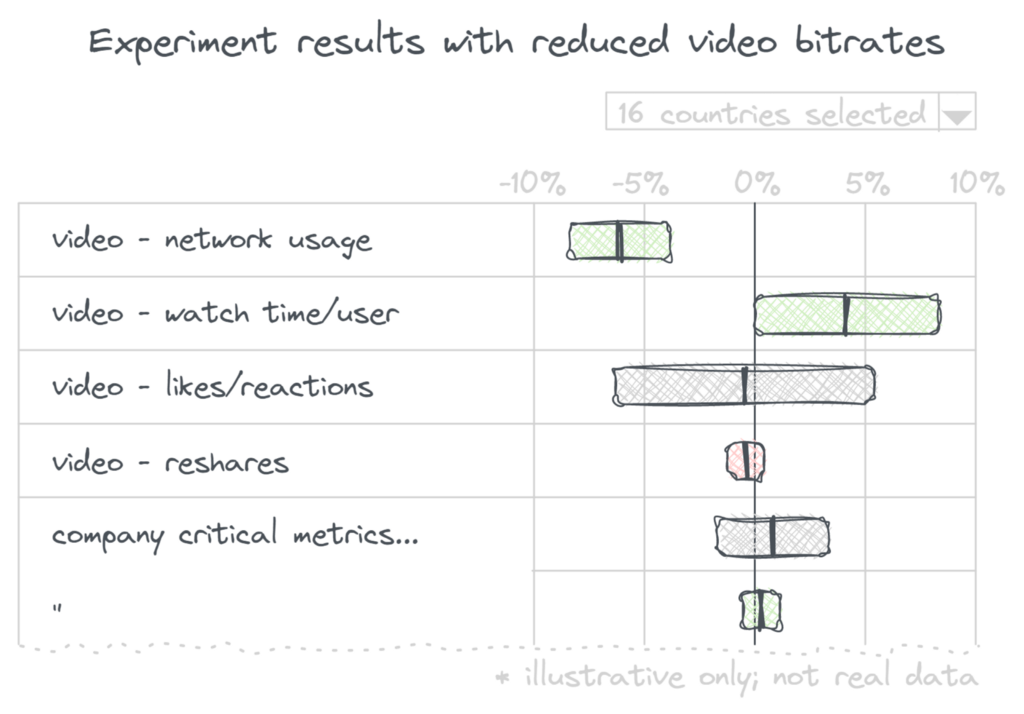
It was at this time, telcos and governments reached out to companies like Netflix, Facebook and Youtube — basically the biggest repositories of video data. They wanted our help in reducing the impact of video on networks, until more capacity could be added or the demand died down. Specifically, they asked us to lower visual quality on video and which should lower bandwidth used and hopefully keep networks up. No more HD video for a bit.
At Facebook, we quickly deployed a special configuration that capped automatic video quality scaling to a max of 480p or 720p depending on the region. We believed that visibly reducing visual quality on video meant a poorer experience for people. Common sense suggests this results in lower consumption, and satisfaction. But these were not normal times. And so we launched this fix and braced ourselves to watch our “watch time” metrics drop.
A puzzle!
But what happened next was incredible. Instead of the expected drop, we saw significant increase in video watch time in some very big countries like India. Even though we were able to save the network by serving far fewer bytes, our core metrics were going up. Craziness!

We were stumped! Had we been overserving visual quality? Were we working harder, only to make things worse for our users?
Some background
Almost every change at Facebook is shipped as an experiment. Even changes like this — which involve no UX changes — are first shipped to a small % of users. We pause briefly to make sure that nothing dramatic happens — no big increase in crashes or failures. We then ramp to most users. We might keep a “holdout” for a bit — a small group of users who don’t get the change. If we see something unexpected in the data, having a holdout makes it easier to understand if what’s unexpected is caused by the new feature — or an external inflection. This approach automatically made every rollout an experiment, with a test and a control group, letting us measure the metric impact above.

Unravelling the mystery
Spelunking in the data, we unraveled the mystery. This effect was strongest in countries like India. Here, most people watched video on their cell phones — using cell data plans, not WiFi. Some teammates and I had spent time visiting with Facebook users in small towns in India recently. The most common data plan we saw in India offered 1GB of cell data — every day, resetting at midnight. 1 gb/day seemed infinite to me, but I spend much of my day tethered to some kind of WiFi at office or home.
Slicing our experiment data by percentiles is what allowed us to piece together the picture. The typical user in India did watch less video when we reduced visual quality. They were hurting, like we expected. But many users that watched a lot of video, watched even more! They also ran out of their 1GB/day data quota often. Reducing visual quality increased how much video they could squeeze in every day — and watch a lot more they did! We’d found a non-trivial set of people with needs that didn’t match the average.
This insight lead us to build a Datasaver mode for Facebook video which we turned on for this set of people. With software, we can have our cake and eat it too — by enabling personalized experiences instead of one-size-fits-all.
Our initial instinct when we saw the data was mistaken. If we’d blindly reacted to this, we would have reduced visual quality for everyone in these countries. Instead we came away with a new level of insight and understanding about our users that helped better serve them. It is the combination of experimentation at scale and time on the ground talking to people that made this possible.
Talk to us
Have a fun story re: how experimentation at scale helps you understand your users better? Looking to talk about the pros and cons of making every change an experiment? Come nerd out with people with opinions on Slack!
Not feeling chatty? Create a free account on statsig.com to see how you can make every change an experiment with 0 setup.