Products
Solutions
Resources


A Bayesian exploration of road rage methodology, and its important applications to experimentation
Disclaimer: this is in good fun and I don’t advocate road rage.
You, dear reader, are driving somewhere nice. However, the driver behind you is determined to make you have a bad day; they’ve come up uncomfortably close behind you and you’re pretty sure they’re a bad driver who should feel bad about how they’re driving.
Soon, they pass you, and the age-old question rings through your brain:
Do I need to let this person know that they’re a jerk?
Let’s use a framework
The decision above is of course a personal one, but it does have some interesting inputs.
Let’s say the world is simple, and people are either a “good driver” or a “bad driver”. If we do flip someone off, but they’re a good driver who made a mistake, we’re the jerk. That’s bad. But we don’t want a bad driver to get away with bad driving without getting the “gift” of feedback! In experimentation we’d discuss this in terms of Type 1 and Type 2 errors:
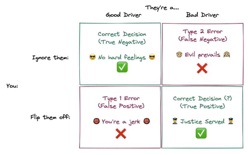
Our objective is to minimize error rate — let’s try to flip off bad drivers and give a friendly wave to good drivers. However, optimizing for these two actions are at odds; if you just wanted to flip off bad drivers, you’d flip off everybody, and if you just wanted to wave to good drivers, you’d wave to everyone!
Math to the rescue
There’s three factors that will help us make our decision and minimize errors:
What % of the time does a bad driver drive badly?
What % of the time does a good driver drive badly?
What % of drivers are bad drivers?
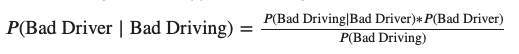
Once we have these, we can calculate what the odds are that a bad driving incident was caused by a bad driver using Bayes’ theorem:
Related: Try the Statsig Bayesian A/B Test calculator.
For anyone unfamiliar with the notation, a brief primer:
The core statement is that we can divide the probability of “bad driving, AND bad driver” by the total probability of “bad driving” to get the proportion of bad driving where a bad driver is at the wheel.
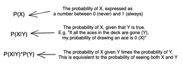
Since we’ve split the world into “good” and “bad drivers”, we can calculate the denominator, or the total probability of bad driving, by combining the probabilities of a “good driver driving badly” and a “bad driver driving badly”:

It’s sometimes easier to just draw this out:
This is loosely a “Probability Space” diagram —
Without having had a bad driving encounter, your best guess as to if a random driver were good or bad would be the population average (in the chart above, 20% bad and 80% good).
But seeing them drive badly gives you information! Though it doesn’t guarantee that they’re a good or bad driver, it should change your expectations to them having a 56% chance to be a bad driver and 44% to be a good driver. This is referred to as “updating a prior”, and it’s a fundamental concept behind Bayesian statistics.
Well, when do I get mad?
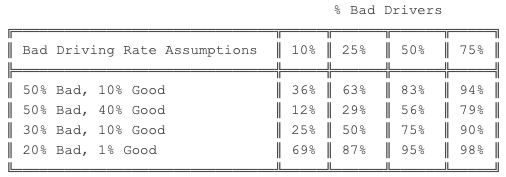
Let’s look at some examples of what this means in practice. I’ll talk about how we can easily come up with some these figures later, but for now…
Let’s use the same numbers as before and say that bad drivers have a 50% chance to drive badly and good drivers have a 10% chance to drive badly. Then we can draw a curve:
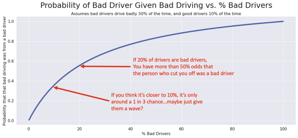
This curve represents how the “% of Bad Drivers” in the population influences the chance that the person who cut you off was a bad driver — and therefore, if you should be mad!
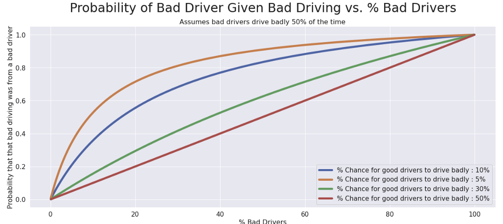
Your other assumptions (how often bad drivers drive badly, and how often good drivers drive badly) will influence the shape of this curve. For example, if we change our assumption about how often good drivers drive badly, we get a very different shape:
Here’s some example rules of thumb for your own driving needs:
Applications in Experimentation
This applies directly to (frequentist-based) experimentation and how people should interpret experimental results in science or business.
Let’s say you are running a/b tests (or Randomized Controlled Trials) with a significance level of 0.05 and a power level of 0.80. Let’s also pretend that we have a known “success rate” for your experiments.
When analyzing your results, your odds that there was a real lift — given you had significant results — can be expressed as:
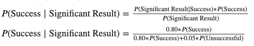
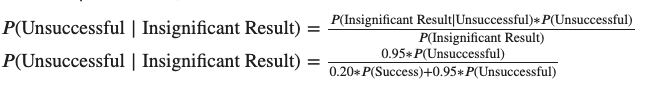
And your odds that there wasn’t a real lift, given you had insignificant results, is:
If we plot those against different “Success Rates”, we get some useful curves:
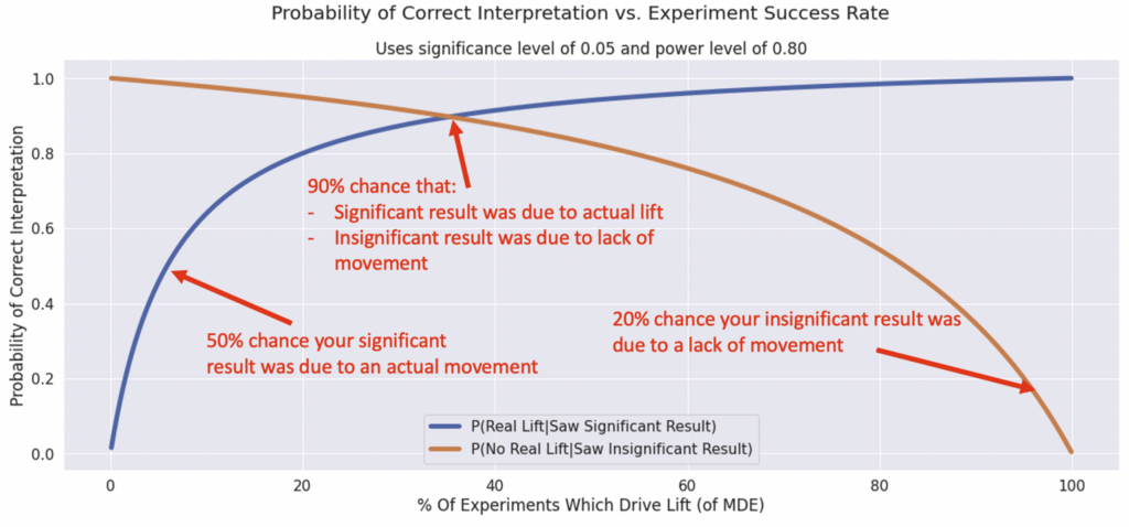
What does this mean? These are basically a plot of how often your statistically significant results will reflect the “intuitive” interpretation of them.
Experiments with middling success rates will have the most trustworthy results across both types
At the tail ends (super risky, or super safe experiments), one of your interpretations will get flaky. For example, if you have a low chance of success, most of your “stat sig wins” will be false positives due to noise. If you have a high chance of success, many of your “neutral” results will be false negatives.
In practice, you may not know your success rate. Some companies like Microsoft or Google track success rates, and smaller companies tend to have more opportunities for wins (low hanging fruit).
Even without knowing your exact rate, though, you might have some intuition like “I think it’s 50/50 that this will drive my targeted lift”, or “I think this is a long shot and it’s only 10%”. This can really help to guide your interpretation of significance in A/B test results. For advanced experimenters, you might consider changing your Power and Alpha to try to avoid flaky interpretations.
Do it yourself!
We can whip this up without much code in Python. You can copy the notebook here. Try not to judge my code too much 😉.
We can define the conditional probability of a bad driver given the inputs above like so:
def p_bad_driver(bad_driver_rate, bad_driver_bad_rate,
    good_driver_bad_rate):

    good_driver_rate = 1-bad_driver_rate
    numerator = bad_driver_bad_rate *
bad_driver_rate
denominator = bad_driver_bad_rate * bad_driver_rate +\
good_driver_bad_rate * good_driver_rate
return numerator/denominator
Let’s check our ~56% number from above:
p_bad_driver(0.2, 0.5, 0.1) > 0.5555555555555555
Looks good! You can copy the notebook to play with any of the parameters and generate new versions of the charts.
In Summary
I hope I’ve convinced you that conditional probability can be a useful way to think about how you interpret the world around you with this silly example. It’s something we all do intuitively, and putting numbers on it helps to confirm that intuition.
This is really important to me as someone who’s worked deeply with experimentation teams as a data scientist. It’s often difficult to communicate our confidence in our results effectively. There’s a lot of probabilities, parameters, and conflicting results involved in testing, and I’ve seen it frustrate some really smart people.
At Statsig, we’re trying to strike the right balance between making experimentation easy and trustworthy, but also giving people the tools to deeply understand what their results mean — it’s an ongoing, but worthwhile process!