Products
Solutions
Resources
And communicating the meaning behind the creation.
About Statsig
In February of 2021, Statsig was founded with an office located in Kirkland, WA. Our mission is to “help people use data to build better products.” With the tools we provide as a service to analyze, visualize and interpret data, our ultimate goal is to help product teams ship their features more confidently (Here, is an article of how it started).
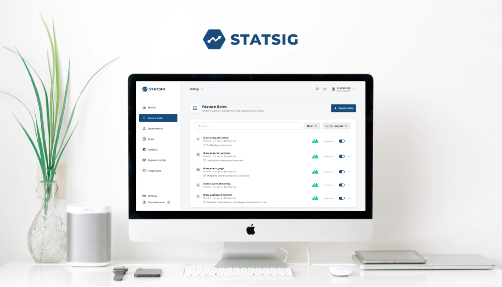
The product we offer today is a faithful replica of the growth infrastructure utilized inside Facebook that allowed it to grow to more than 2 billion users. You can read more about it in these articles we published in the past (articles related to: Feature Flag, Pulse, Holdouts).
Currently at Statsig, a talented team of ex-Facebook employees who have experienced the internal tools that enabled teams to move fast and helped in the decision-making process of feature launches are actively working on bringing the power to everyone.
Motivation behind our new logo
For a company, the logo is meant to visually communicate the unique identity of the brand and what it represents. It’s essentially the face of the company that helps customers to recognize, identify and select our business. This is why it was important for us to reimagine and think through what our company logo should be.
At Statsig, we want our potential customers to have a clear first impression of us as an experimentation and data-driven service that is highly reliable and trustworthy. For our existing customers, we will continue to strive towards keeping that trust based on the effectiveness of our product offerings that we carry forward with our brand.
Logo anatomy & meanings
We chose our logo compositions, typeface and color very carefully that reflect and summarize what we do and offer. The goal was to make sure that individual elements carried specific meanings and intent behind them while together in harmony, also can effectively communicate our strategy.
Through shapes, typeface and color, we designed our logo to communicate both the nature and characteristics of our product. Furthermore, we designed our logo to depict the modern and user-friendliness of our product, two traits commonly lacking in other B2B SaaS products.
Next steps
We are actively applying our new logo in various social media channels and most importantly, across our product and website where we first meet our customers. As our business scales and we satisfy more and more of our customers, we believe that our brand identity will continue to stick with them and be remembered.
Internally at the company, there are also some exciting new projects that awaits us that will help in developing in a good culture and work setting. With our new logo, we just started to develop posters, stickers and other types of swags. In the near future, we will be publishing our own brand guidelines as well. Stay tuned for more!
