Products
Solutions
Resources


When exploring the world of data visualization, you'll encounter various chart types, each with unique strengths.
Triangle charts, also known as retention tables, are a powerful tool for understanding user behavior over time. In this guide, we'll explore what triangle charts are, their structure, and when it's most beneficial to use them.
Whether you're a product manager, marketer, or data analyst, mastering triangle charts can provide valuable insights into your user retention strategies.
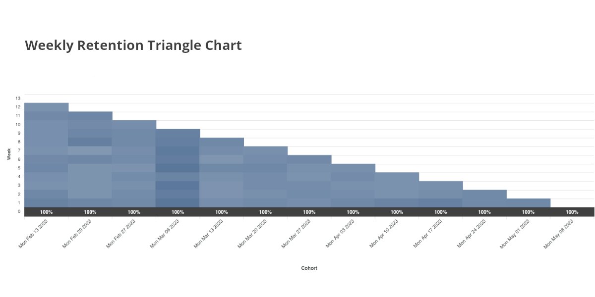
What is a triangle chart?
A triangle chart, as described in Statsig's documentation, is a visual representation that helps you gauge how well you're retaining users after their initial interaction with your product or service. It's called a "triangle" chart because of its triangular shape when visualized, with the data tapering off as time progresses.
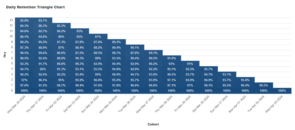
Structure of a triangle chart
The triangle chart is divided into two main sections:
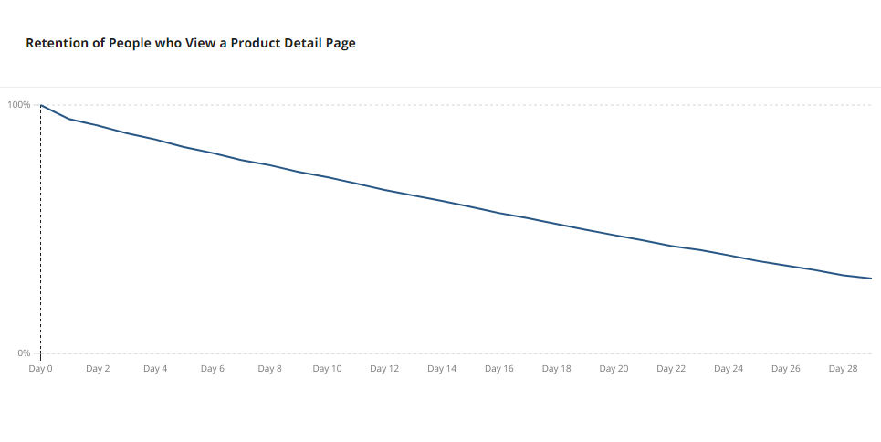
Retention graph (J-curve): This graph shows the retention rate over time in a curve format, often resembling the letter 'J'. It's useful for quickly assessing the general retention trend.
Retention table (triangle chart): This is the main focus of our discussion. The retention table tracks cohorts of users based on their first engagement date, which is defined by your start event, and shows the percentage of these users returning, as defined by your return event, over subsequent days or weeks.
The leftmost column of the chart identifies these cohorts, while the top row displays time intervals (days, weeks) after the initial engagement. The body of the chart is filled with percentages, each indicating the proportion of users from a cohort who were active at a specific time interval.
Reading a triangle chart
Vertical analysis: Looking down a column allows you to compare the retention rates of different cohorts at the same lifecycle stage.
Horizontal analysis: Reading across a row shows how a single cohort's retention evolves over time.
High numbers in the initial columns suggest strong user engagement right after the first interaction, while consistent percentages over longer intervals indicate successful long-term retention strategies.
When to use triangle charts
Triangle charts are particularly useful in a bunch of scenarios, including:
Analyzing user retention: They are the go-to choice for measuring how well your product retains users over time. This is crucial for identifying whether new features, updates, or changes in strategy are improving user engagement.
Comparing cohorts: If you want to compare how different groups of users, perhaps exposed to different features or marketing campaigns, retain over time, triangle charts can provide clear insights.
Identifying patterns: They help in spotting patterns such as specific times when users tend to drop off or when they are most engaged.
Product development: Understanding retention can guide product development by highlighting areas that need improvement to keep users coming back.
Investor reporting: For startups and companies seeking investment, showing strong retention metrics through triangle charts can be a compelling way to demonstrate product-market fit.
Triangle charts in Statsig
In Statsig, triangle charts are used to show how well you are retaining users after their first interaction with your product or service.
They track cohorts of users based on their first engagement date and display the percentage of these users returning over subsequent days or weeks.
The chart is structured with the leftmost column identifying the cohorts and the top row showing time intervals, with the body of the chart is filled with percentages—each indicating the proportion of users from a cohort who were active at a specific time interval.
This format allows for both vertical analysis to compare different cohorts at the same lifecycle stage and horizontal analysis to observe how a single cohort's retention evolves over time.
Get started now!
Using triangle charts for retention
Triangle charts are a vital tool for anyone looking to understand and improve user retention. By visualizing how different cohorts engage with your product over time, you can make informed decisions to enhance user experience and increase long-term engagement.
Remember, the key to leveraging triangle charts effectively is to regularly review and analyze them, using the insights to iterate on your product and marketing strategies.
For those looking to delve deeper into retention analysis using triangle charts, Statsig's documentation provides a comprehensive guide on interpreting and utilizing these charts.
If you encounter scenarios not covered in the documentation or need further assistance, don't hesitate to reach out to Statsig's support channels for expert guidance.
Introducing Product Analytics